
CSS Layout Overflow: A Comprehensive Tutorial
Welcome to our comprehensive guide on mastering CSS Layout Overflow! In the ever-evolving world of web development, understanding the intricacies of Cascading Style Sheets (CSS) is a must. CSS empowers developers to shape the visual presentation and layout of web content, and one pivotal aspect that demands attention is the management of overflow within HTML elements. In this article, we delve deep into the world of CSS Layout Overflow, shedding light on the versatile overflow property and its various values. By the end of this tutorial, you’ll be well-equipped to control overflow like a pro, ensuring that your web designs are both visually appealing and user-friendly. So, let’s embark on this journey to unravel the secrets of CSS Layout Overflow, and equip ourselves with invaluable skills for web development.
CSS Layout Overflow is a crucial piece of the web design puzzle, and it plays a pivotal role in creating engaging and responsive web interfaces. Throughout this guide, we’ll explore the four key values of the overflow property—visible, hidden, scroll, and auto—and learn how each affects the presentation of content within HTML elements. Whether you’re designing fixed or flexible layouts, dealing with lengthy text that needs truncation, or crafting scrollable image galleries, mastering CSS Layout Overflow is essential. By the end of this tutorial, you’ll have the knowledge and skills to confidently handle overflow scenarios, enhancing the overall user experience of your web projects. So, without further ado, let’s dive into the world of CSS Layout Overflow and unlock its full potential.
Prerequisites:
Before diving into this tutorial, you should have a basic understanding of HTML and CSS. If you’re new to CSS, you may want to start with introductory tutorials to grasp the fundamentals of styling web pages.
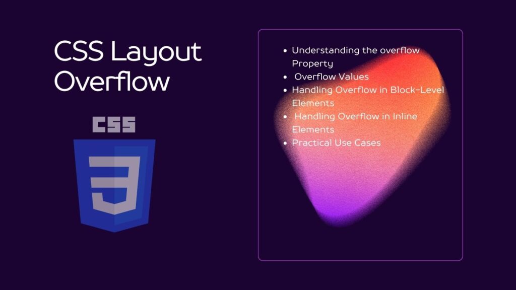
Table of Contents
Understanding the overflow Property
The overflow property is used to control what happens when the content within an element overflows its dimensions. It is a versatile property that can be applied to both block-level and inline elements.
Overflow Values
Let’s explore the different values that the overflow property can take:
overflow: visible: This is the default value. It allows content to overflow the container, making it visible outside the box.
   .container {
     overflow: visible;
   }
overflow: hidden: This value hides any content that overflows the container. It clips the content to the container’s dimensions.
   .container {
     overflow: hidden;
   }
overflow: scroll: This value adds scrollbars to the container, allowing users to scroll and view the hidden content.
   .container {
     overflow: scroll;
   }
overflow: auto: This value automatically adds scrollbars when needed. If the content fits within the container, no scrollbars are displayed.
   .container {
     overflow: auto;
   }
Handling Overflow in Block-Level Elements
Block-level elements, such as <div> or <p>, can have their overflow controlled using the overflow property. This is commonly used for containers with fixed dimensions.
Example:
<!DOCTYPE html>
<html>
<head>
  <link rel="stylesheet" type="text/css" href="styles.css">
</head>
<body>
  <div class="container">
    <p>This is some long text that will overflow.</p>
  </div>
</body>
</html>
/* styles.css */
.container {
width: 200px;
height: 100px;
overflow: scroll;
}Handling Overflow in Inline Elements
Inline elements, like <span> or <a>, can also have their overflow controlled using the overflow property. However, it’s less common to use overflow on inline elements because they don’t inherently contain content that overflows.
Example:
<!DOCTYPE html>
<html>
<head>
  <link rel="stylesheet" type="text/css" href="styles.css">
</head>
<body>
  <p>
    This is some <span class="highlight">highlighted text</span> with overflow.
  </p>
</body>
</html>
/* styles.css */
.highlight {
overflow: hidden;
text-overflow: ellipsis;
white-space: nowrap;
}Practical Use Cases
Understanding how to control overflow is crucial for various web design scenarios, such as:
- Creating responsive layouts with fixed or flexible dimensions.
- Truncating text when it exceeds a certain length.
- Designing image galleries with scrollable content.
- Implementing custom scrollbars to enhance the user experience.
Conclusion
In conclusion, this tutorial has been your comprehensive guide to understanding and harnessing the power of CSS Layout Overflow. We’ve navigated through the intricate world of Cascading Style Sheets, focusing on the versatile overflow property and its various values—visible, hidden, scroll, and auto. With this newfound knowledge, you are now well-equipped to take control of content overflow in web development, ensuring that your designs are not only visually captivating but also user-friendly. CSS Layout Overflow is a fundamental aspect of modern web design, and by mastering it, you can elevate your skills and create seamless, responsive, and engaging web interfaces.
Remember that CSS Layout Overflow is not just a technical detail; it directly impacts the user experience. Whether you’re crafting responsive layouts, managing text truncation, or designing interactive image galleries, your ability to handle overflow effectively is crucial. As you continue your journey in web development, keep exploring and experimenting with CSS Layout Overflow to discover innovative solutions that enhance the way users interact with your web projects. Stay curious, keep learning, and make the most of CSS Layout Overflow to create web experiences that leave a lasting impression.


