

CSS Horizontal Navigation Bar: A Step-by-Step Tutorial
In the ever-evolving landscape of web development, mastering CSS is essential to craft captivating and functional web interfaces. One of the quintessential components of web design is the creation of sleek navigation bars. This tutorial will guide you through the process of building a visually appealing and responsive CSS horizontal navigation bar, with a special focus on CSS dropdowns. Whether you are a beginner seeking to strengthen your CSS foundation or an experienced developer aiming to refine your skills, this step-by-step guide will empower you to craft elegant navigation menus that seamlessly integrate dropdown functionality. Join us as we embark on this journey to transform your web design prowess by harnessing the power of CSS.
Before we dive into the nitty-gritty of crafting horizontal navigation bars, it’s crucial to grasp the concept of CSS dropdowns. Dropdown menus are an integral part of modern web design, offering a compact and user-friendly way to organize and navigate through a website’s content. By incorporating CSS dropdowns into your navigation bar, you’ll enable users to access subcategories and related pages effortlessly. In this tutorial, we’ll explore how to implement dropdown functionality within your CSS-based navigation, ensuring an enhanced user experience and a polished, professional appearance. Let’s embark on this journey to harness the full potential of CSS dropdowns in your web projects.
To embark on this CSS adventure and create stunning horizontal navigation bars with dropdowns, a basic understanding of HTML and CSS is recommended. If you’re new to these technologies, don’t worry; we’ll provide clear and comprehensive explanations along the way. Grab your preferred code editor, ensure your HTML structure is ready, and have a willingness to explore the art of web design with CSS. Whether you’re building your first website or looking to refine your existing skills, this tutorial will equip you with the knowledge to implement CSS dropdowns effectively and elevate your web development game.
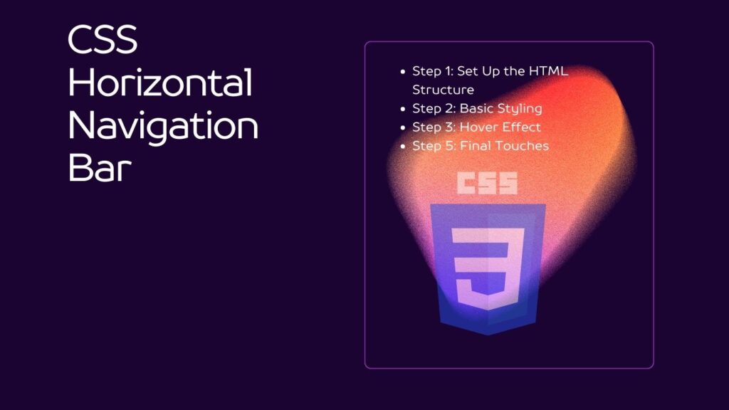
Table of Contents
Prerequisites
Before we get started, make sure you have a basic understanding of HTML. If you’re new to HTML, you can learn the basics from resources like W3Schools.
Step 1: Set Up the HTML Structure
To begin, create a basic HTML structure for your webpage. We will have an unordered list <ul> containing list items <li>, which represent the navigation links. Here’s the HTML code:
<!DOCTYPE html>
<html>
<head>
    <link rel="stylesheet" type="text/css" href="styles.css">
</head>
<body>
    <ul class="navbar">
        <li><a href="#">Home</a></li>
        <li><a href="#">About</a></li>
        <li><a href="#">Services</a></li>
        <li><a href="#">Contact</a></li>
    </ul>
</body>
</html>
We’ve linked an external CSS file called styles.css in the <head> section. This is where we’ll define our CSS rules.
Step 2: Basic Styling
In styles.css, let’s apply some basic styling to our navigation bar. We’ll remove the default list styles, set the list items to display inline, and style the links:
/* Reset default list styles */
.navbar {
    list-style-type: none;
    margin: 0;
    padding: 0;
}

/* Display list items horizontally */
.navbar li {
    display: inline;
    margin-right: 20px; /* Add some spacing between items */
}

/* Style the links */
.navbar li a {
    text-decoration: none;
    color: #333;
    font-weight: bold;
}
Step 3: Hover Effect
To create a hover effect when the mouse is over a navigation link, add the following code to styles.css:
/* Hover effect */
.navbar li a:hover {
    color: #007bff; /* Change color on hover */
}
Now, when you hover over a link, the text color will change to blue.
Step 4: Active Link Styling
Let’s style the active link to indicate the current page. You can do this by adding a class to the active link in your HTML and styling it accordingly in styles.css:
<!-- Add a class to the active link -->
<li><a href="#" class="active">Home</a></li>
/* Style the active link */
.navbar li a.active {
color: #007bff; /* Active link color */
}Step 5: Final Touches
You can further customize your navigation bar by adjusting fonts, background colors, borders, and more in styles.css. Experiment with these properties to achieve your desired look and feel.
Conclusion
In closing, this tutorial has taken you on a journey into the fascinating world of web design, with a specific focus on mastering CSS dropdowns. The ability to create stylish and functional horizontal navigation bars enriched with dropdown menus is a valuable skill for any web developer. By following the step-by-step instructions provided, you’ve acquired the knowledge to craft navigation bars that not only enhance user experience but also add a touch of professionalism to your web projects. Remember, practice makes perfect, and as you continue to explore and experiment with CSS dropdowns, your web development capabilities will continue to evolve.
The importance of CSS dropdowns in modern web design cannot be overstated. These elements facilitate user-friendly navigation, allowing visitors to seamlessly access subcategories and related content. As you continue your journey in web development, consider the possibilities that CSS dropdowns offer, from enhancing website navigation to creating sophisticated and interactive interfaces. With the foundation laid in this tutorial, you’re well-equipped to integrate dropdown menus into your future web endeavors, and your ability to create visually appealing and user-friendly websites is sure to flourish. Stay curious, keep experimenting, and enjoy the endless creative possibilities that CSS dropdowns bring to your web design toolkit.

